
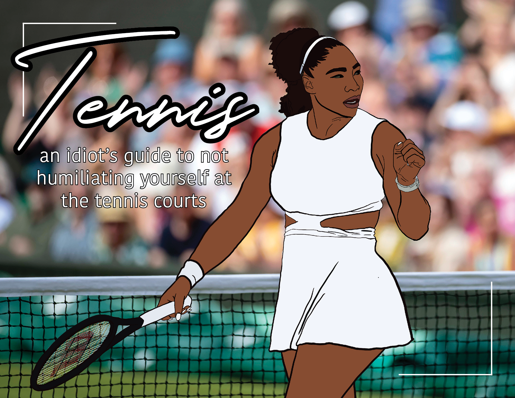
Art + Design Work
A collection of art, design and branding work.
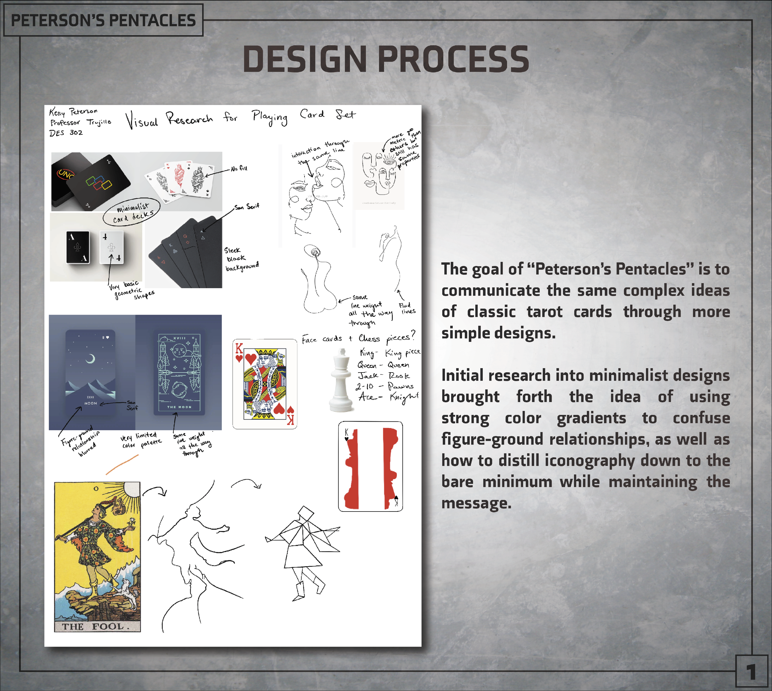
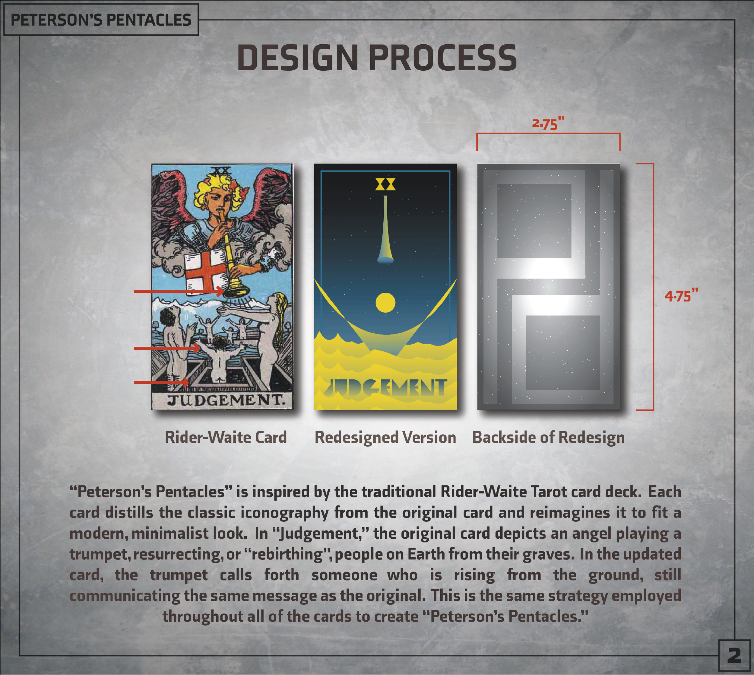
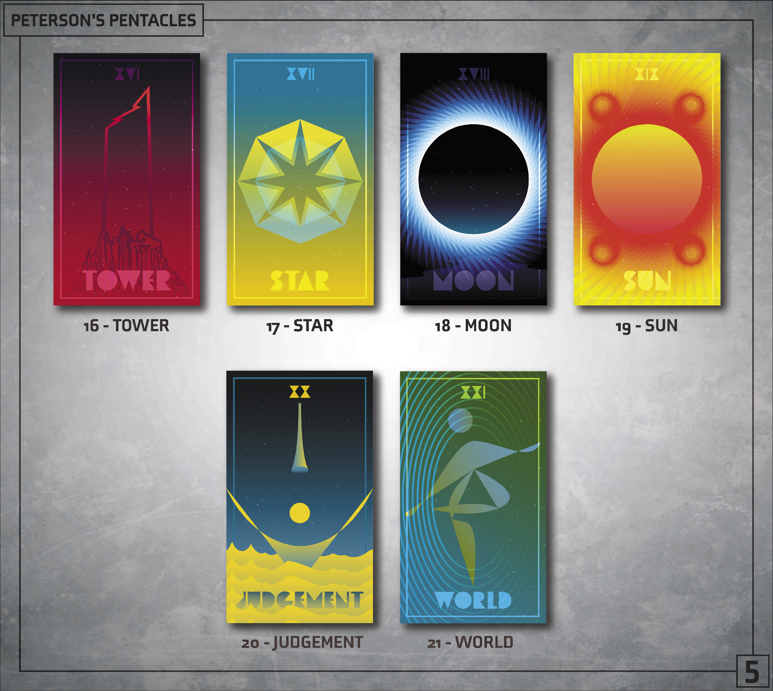
I’ve always been an artist, throughout high school I took every opportunity I had to exercise that. When college rolled around, I lost touch with that part of my life. After freshman year I added a minor in Communication Design. This opened the door for me to exercise my creativity again. I’ve also picked up some new skills on the way, and have become proficient in the Adobe Creative Cloud and on Procreate.
Scroll for more!
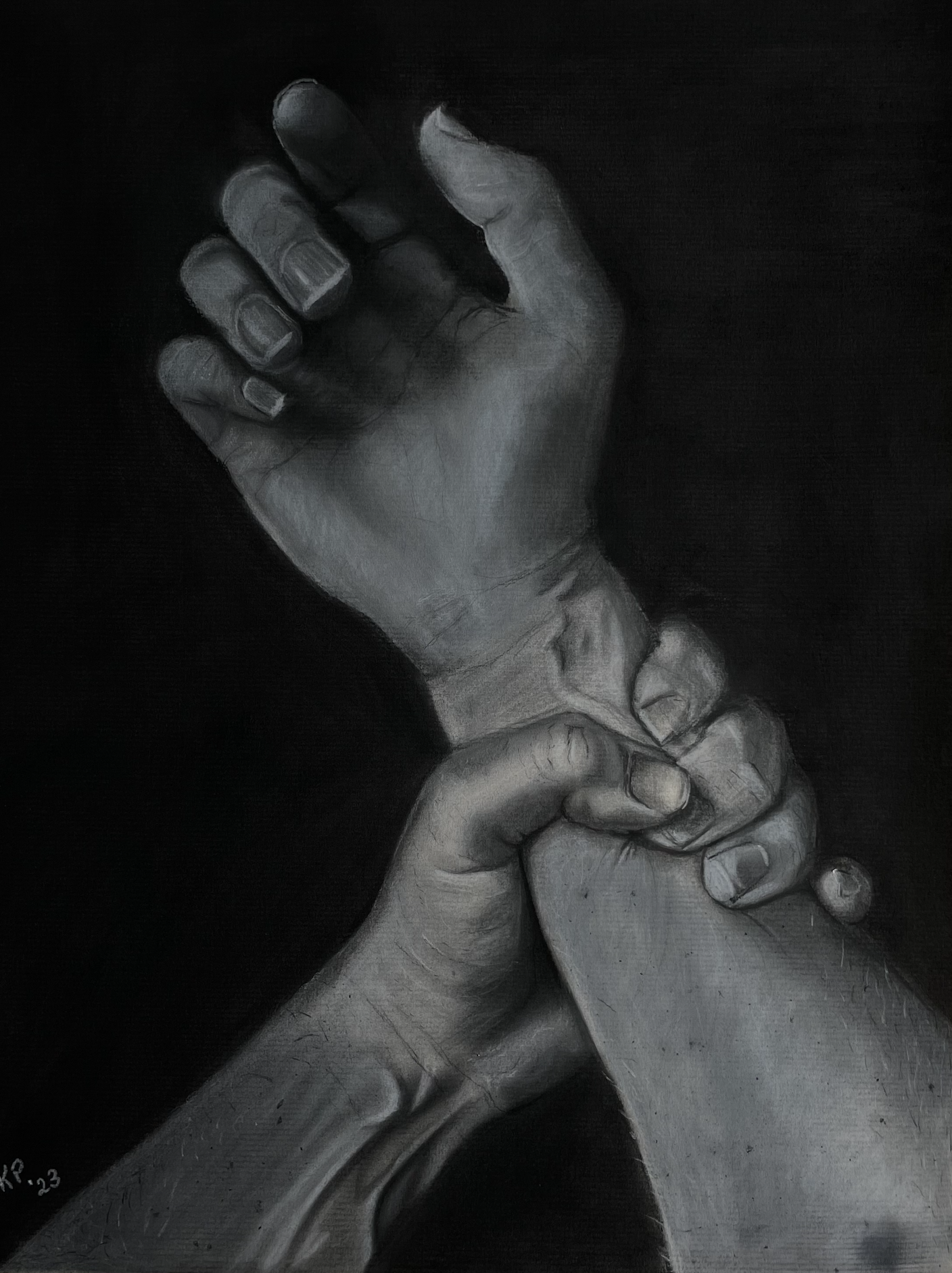
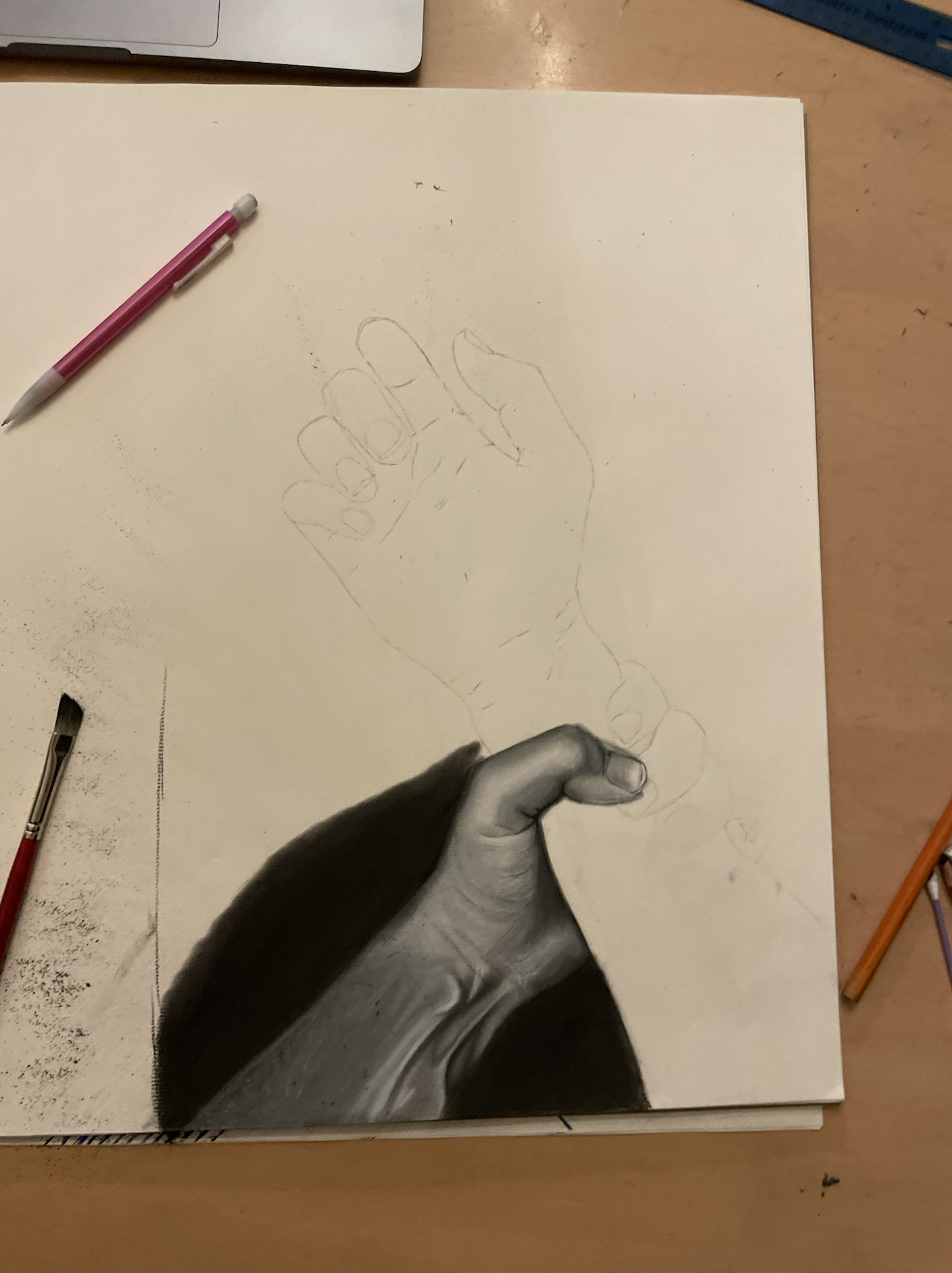
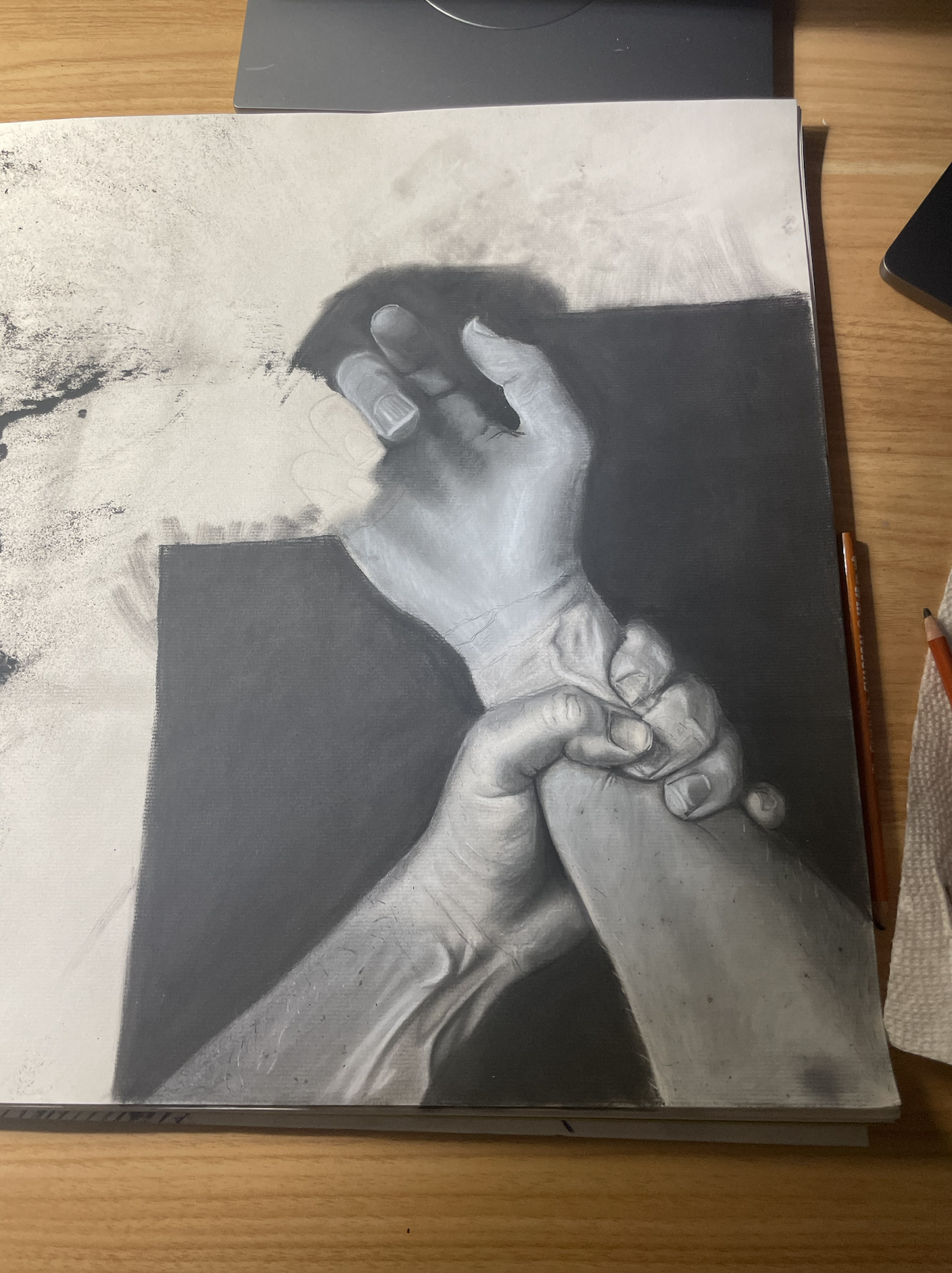
"Get a Grip" | Charcoal Drawing | 2023


Reference Image
“Wash your hands” | Procreate Drawing | 2023


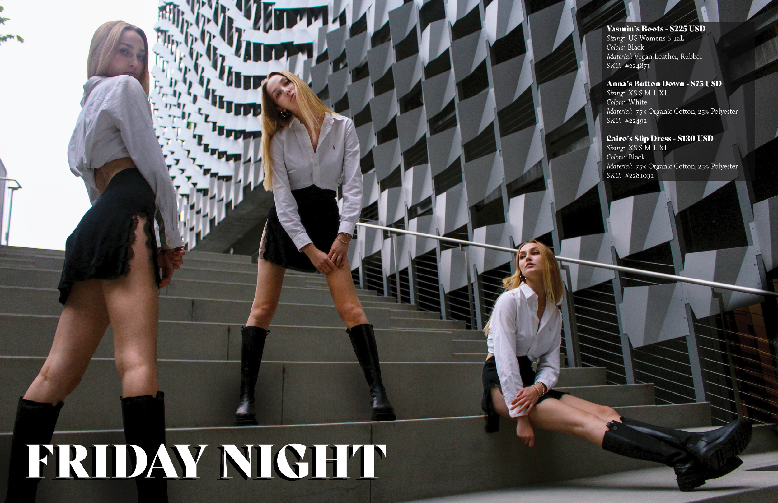
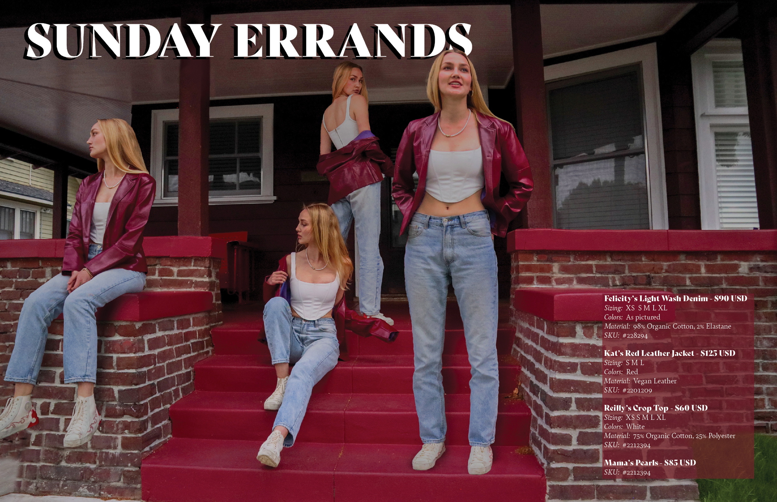


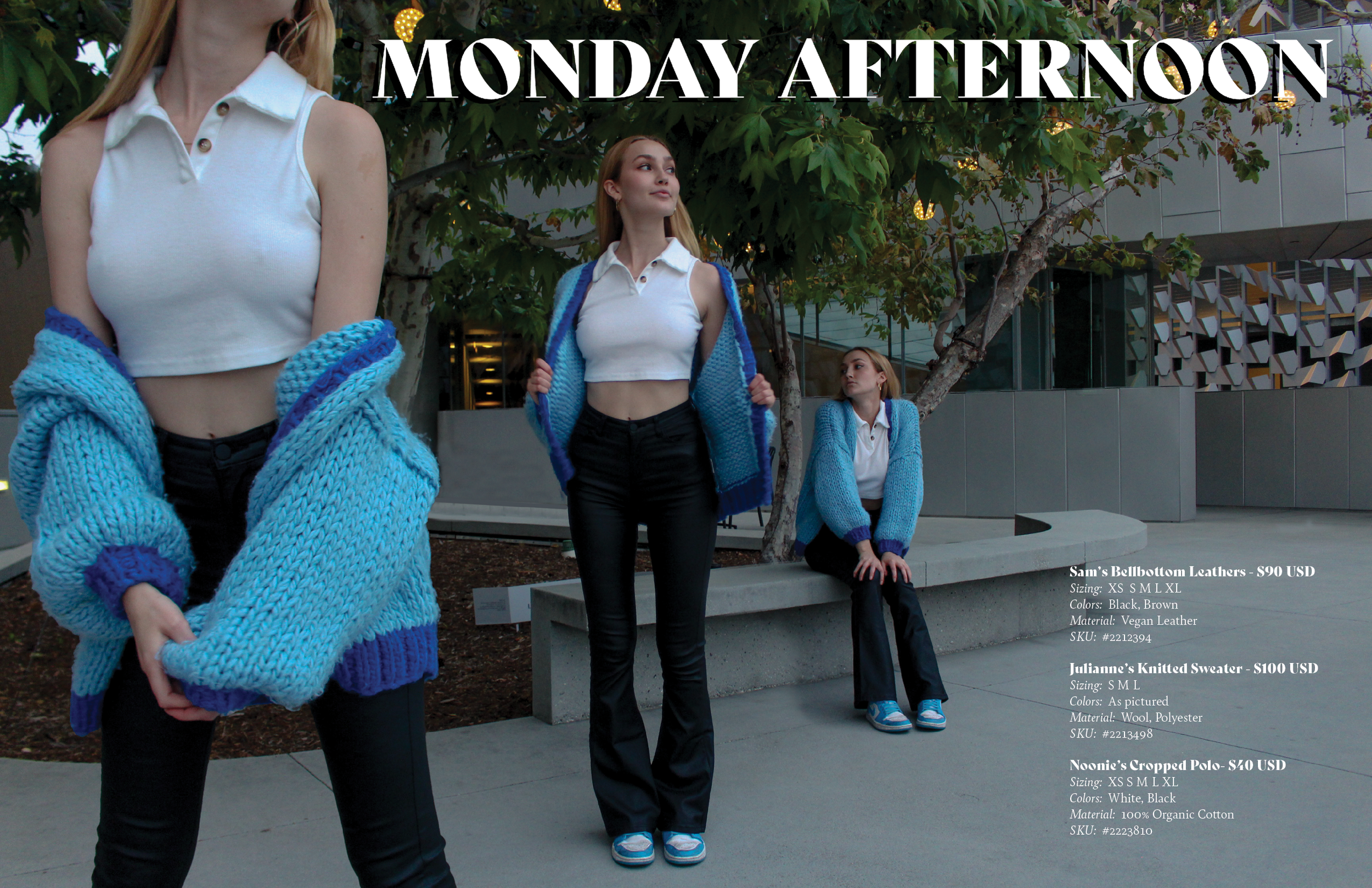
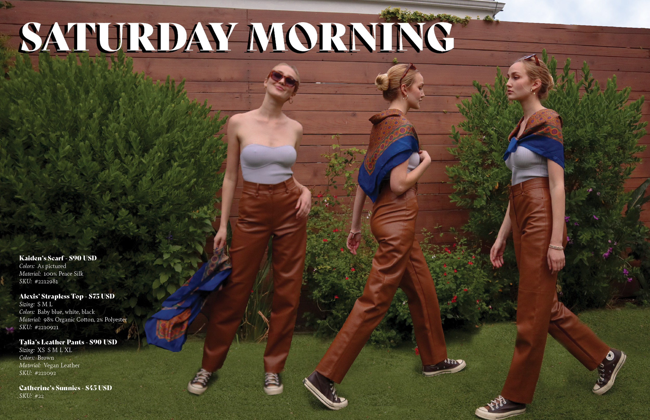
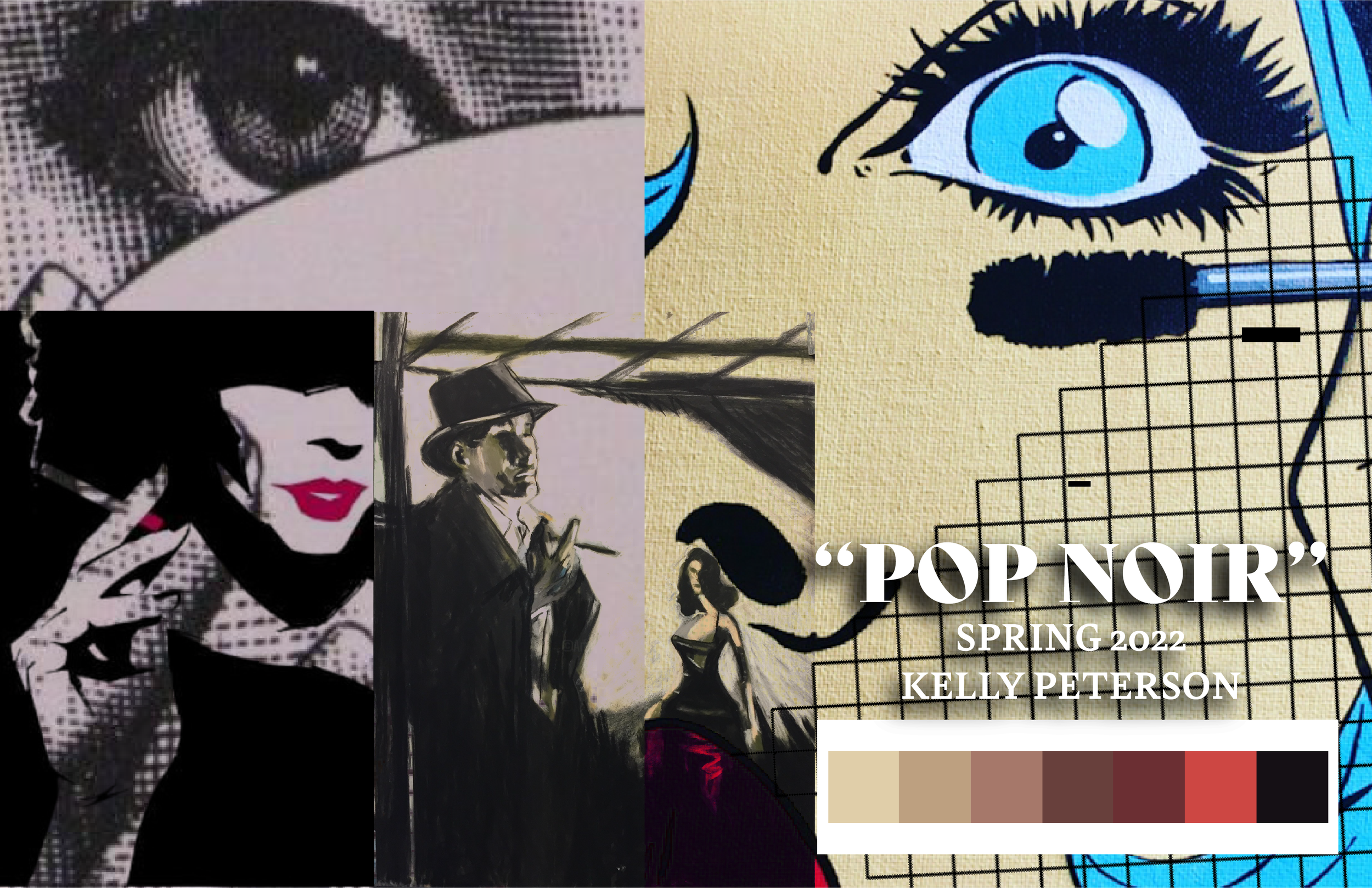
“POP NOIR” Streetwear Collection
"Pop Noir" is a pop art and noir film themed streetwear collection for the fictitious brand "Beatnik." I drew on the mystery of muted colors of old noir films and applied those principles to original pop art elements with a 2022 twist to them. After designing the graphics, I then texture-mapped them onto garments pulled from H&M's website, created fashion flats for each product, and then designed the brand's hang-tags and labels. This project was completed with Adobe Photoshop and Illustrator, and Procreate for the iPad.


Somnio Music Festival
Group Project completed with Etta Harshaw and Crystal Guo

"Somnio" is a concept for a new music festival centered around the experience of Immigrants to America and first-generation Americans. This was a group project completed for my Design III class with designers Crystal Guo and Etta Harshaw. The purpose of the project was to design the brand identity and assets associated with a music festival, but Crystal wanted to use this project to shed light on the experiences of immigrants and first-gen Americans.

While we each individually spearheaded specific assets for the project, it was collaborative in deciding the overall brand image and critiquing and iterating each others designs. Logo by Etta Harshaw.
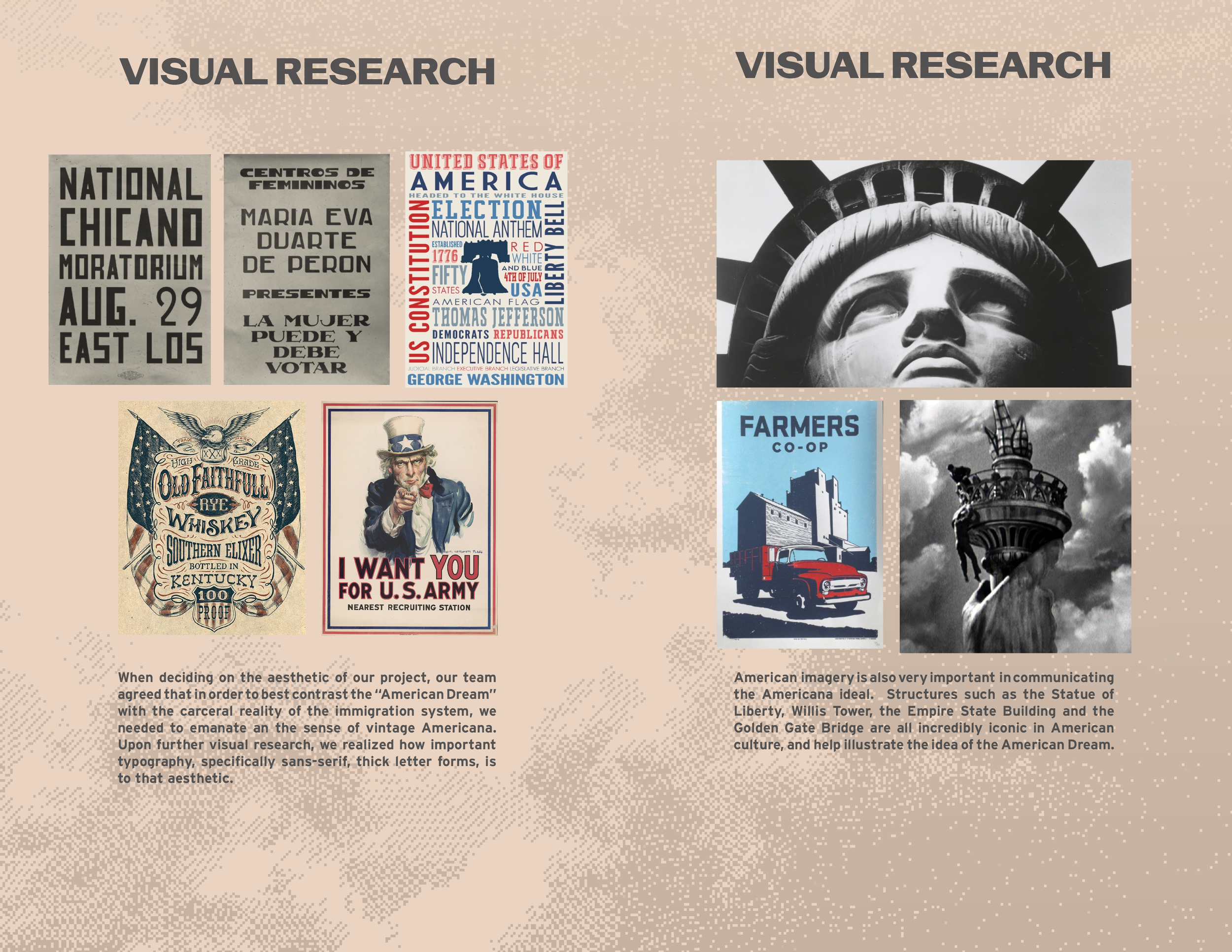
Visual research we derived inspiration from for this project.
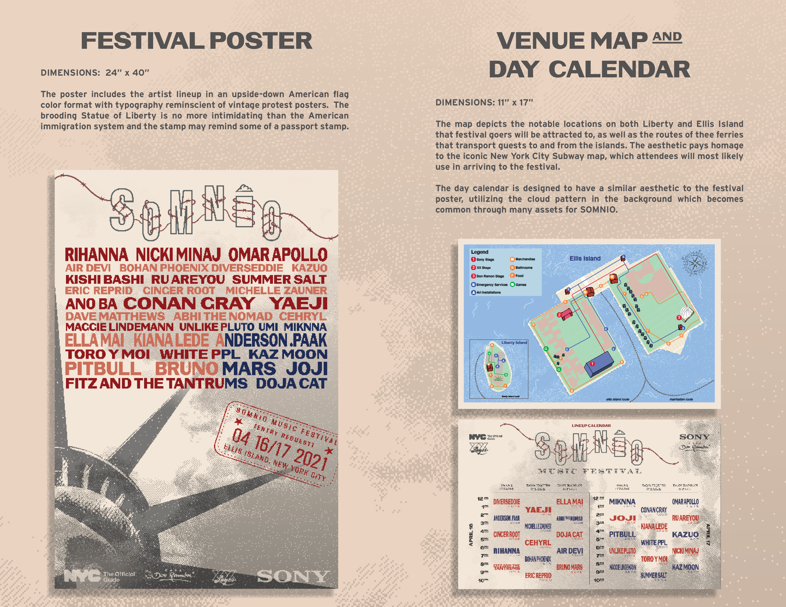
The festival poster on the left was spearheaded by me. I wanted to incorporate American imagery that signifies the "American Dream." I also wanted to turn the American ideal on its head to create a dialog about the first-gen/immigrant experience in America. In order to do this, I stylized the artist lineup to look like an upside down American flag, and included a brooding depiction of the Statue of Liberty. Venue map by Etta, day calendar by me.
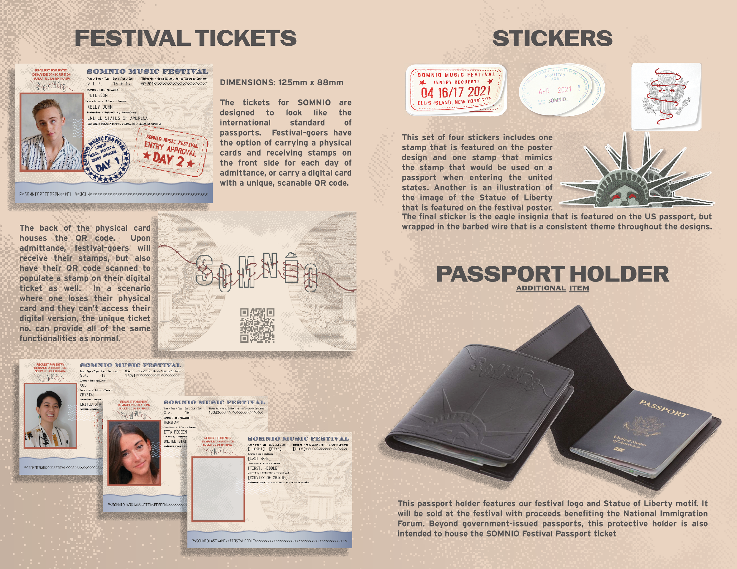
In designing the festival tickets, we wanted to create something unique to our festival, which meant that we wanted to stray away from the norm of wristbands, and make the ticket something more novel. For this design, spearheaded by me, I wanted to emulate the American passport, as that is something idealized by our culture. The front side allows space for stamps to signify admission to the festival on both days, similar to how one would stamp a passport for entry into a new country. The backside includes a QR code for a digital ticket that functions in the same way. Stickers by Etta, passport holder by Crystal.
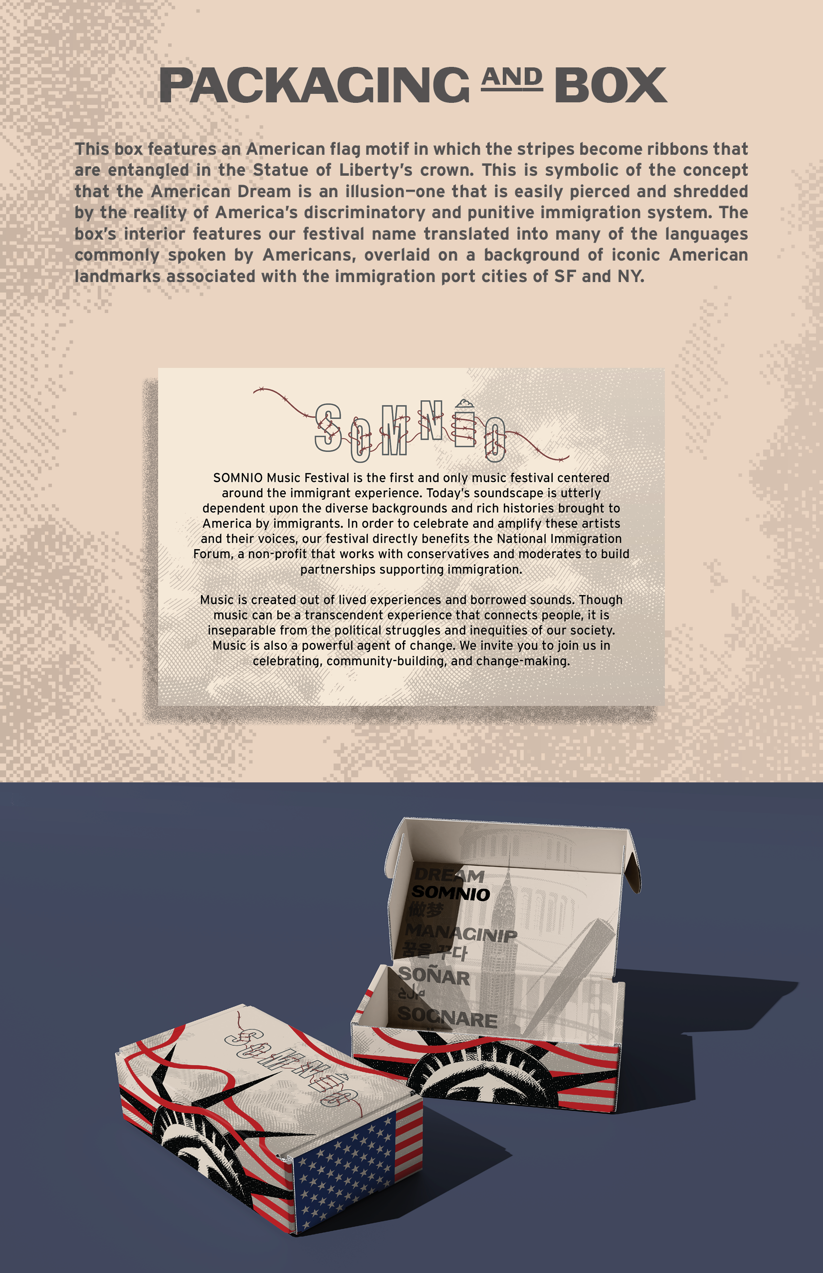
Packaging and box by Crystal Guo

This is my deliverable for my final project in Design III. The goal of the project was to design a unique line of merchandise for the Roski School of Art and Design at USC. In doing this, we had to complete three separate items of clothing or merch and maintain a consistent theme throughout.
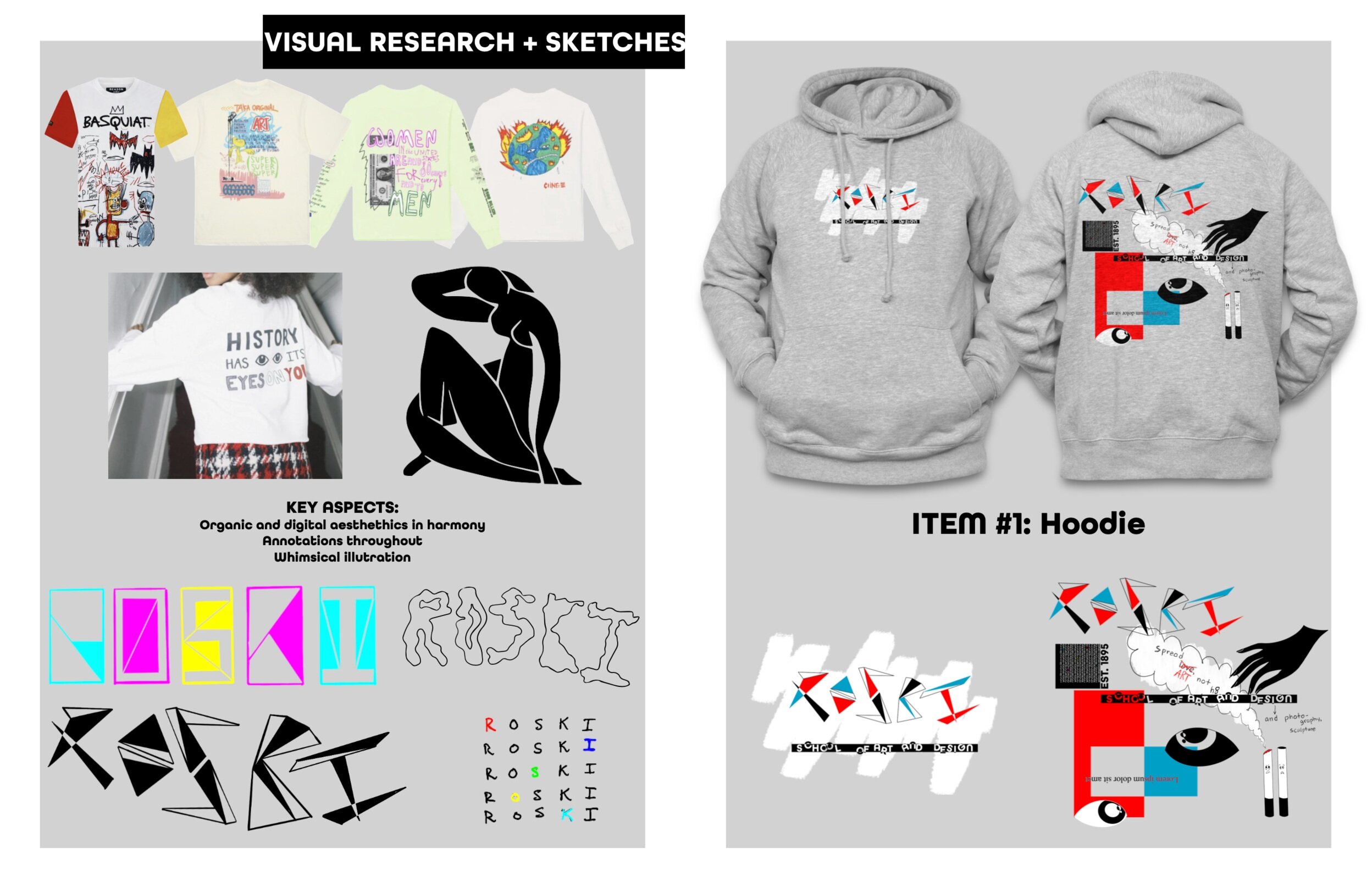
I really wanted to highlight the artistic process as well as some common perceptions, and sometimes stereotypes, of artists in my designs for this project. On the left you can see some inspiration that I pulled. I was especially influenced by Jean Michel Basquiat and his illustrative, layered style of design. You can also see some very initial stages of sketches I completed that would end up directing my style for this piece. On the right side is the first of three deliverables: a hoodie.
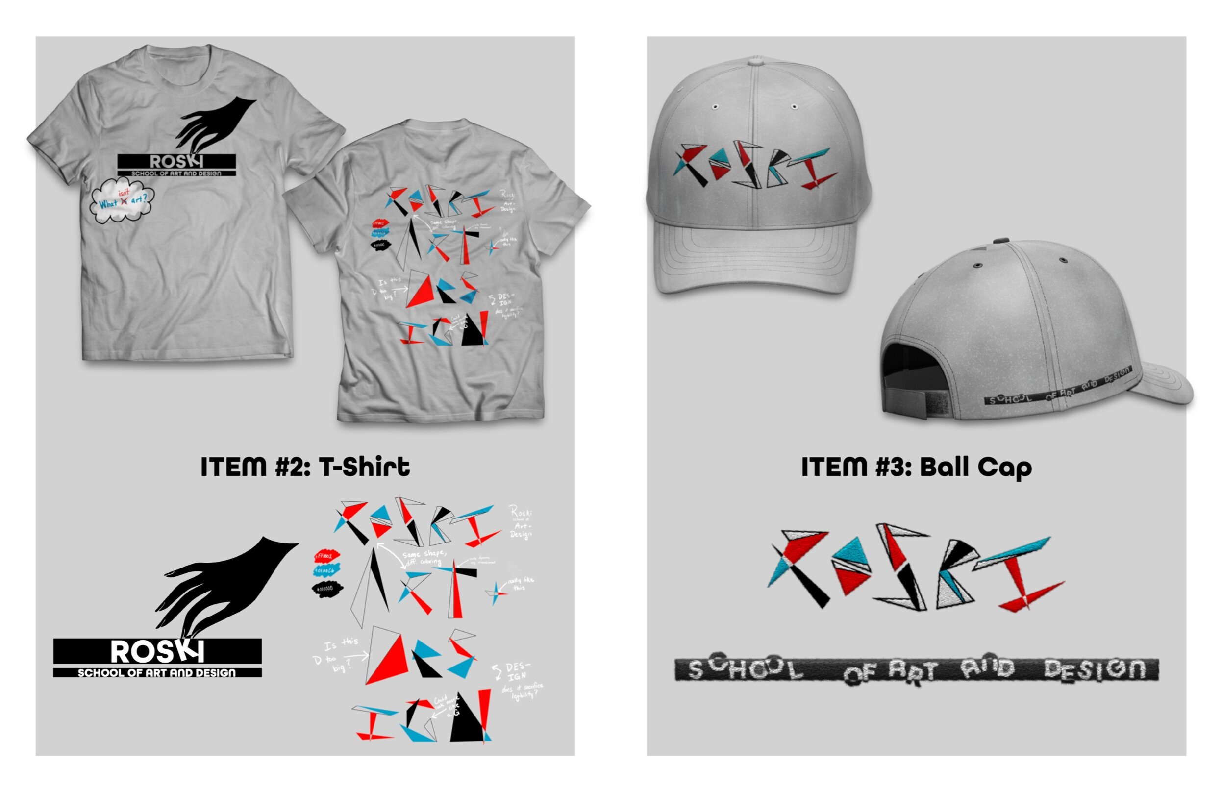
The final two deliverables are pictured above. The design of each item maintains a similar theme and repurposes some of the imagery seen in the other deliverables. One of my favorite components of this project is the embroidery done on the hat.

“Shut your mouth!” - 2021
This is a procreate drawing that I completed over the span of 6 months from December 2020 to June 2021. It took approximately 40 hours to complete!


“Touch” - 2020, Procreate Drawing


When No One’s in the Room
2020, Adobe Photoshop, Illustrator, Lightroom and shot on a Canon EOS M50
This movie poster design concept was done for Design II at USC. The assignment was to conceptualize a movie plot and design a movie poster for it—but we were given a random genre before hand. My given genre was “romcom,” and my ideas began to flow. The concept for the movie is set in the 90’s, based around sex work in the New York nightlife. I wanted the movie to be very raunch comedy, and wanted to communicate that through the movie poster design. The picture shows a woman’s hand putting her undergarments on the door handle, a widely accepted sign asking for privacy. The title treatment is reminiscent of a neon sign, which nods toward the nightlife the movie is based within.
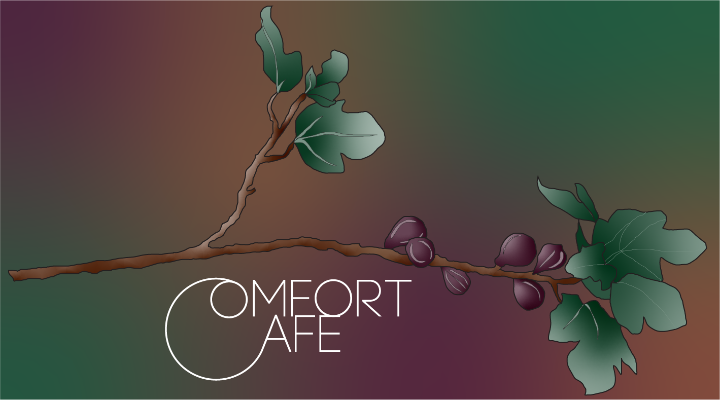
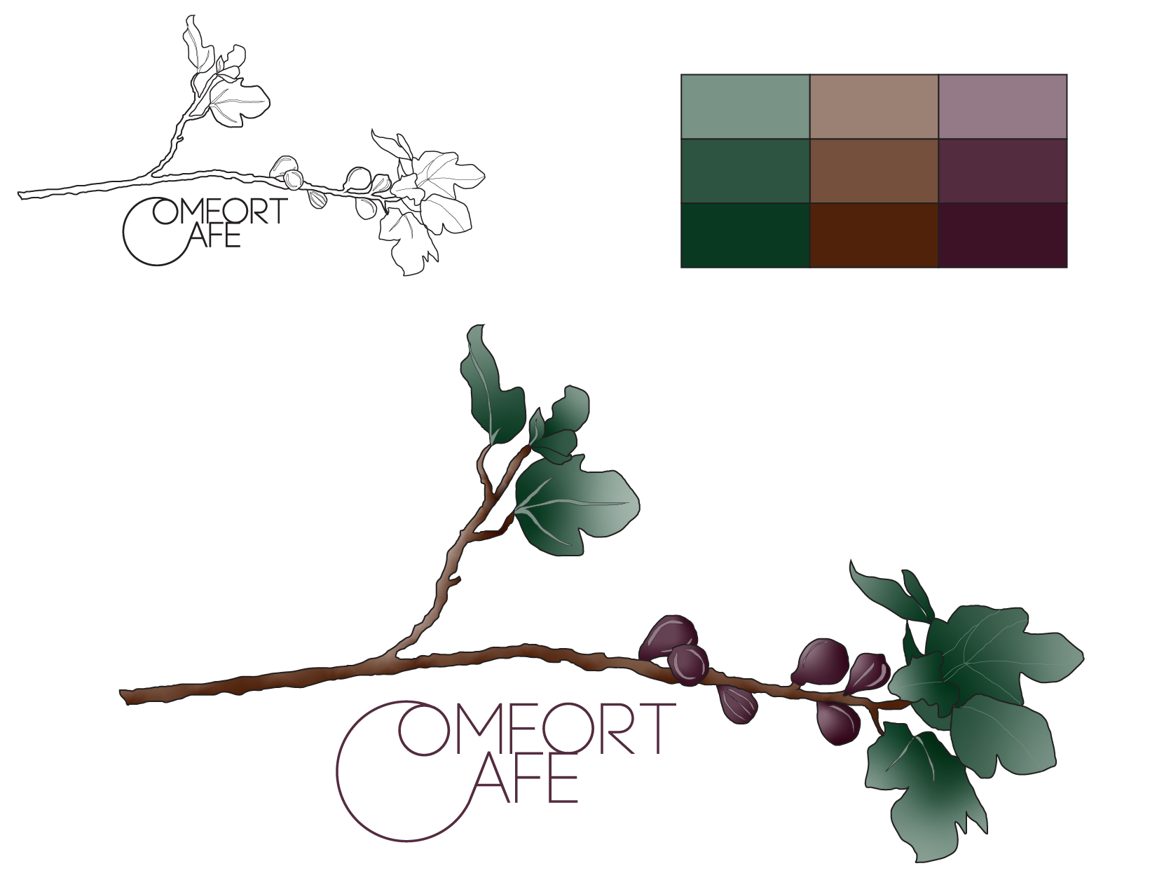
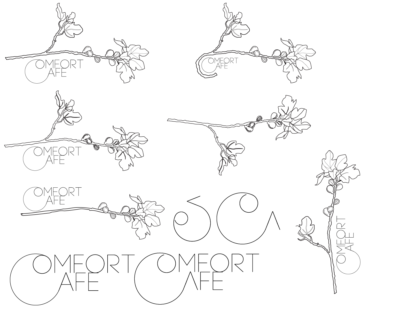
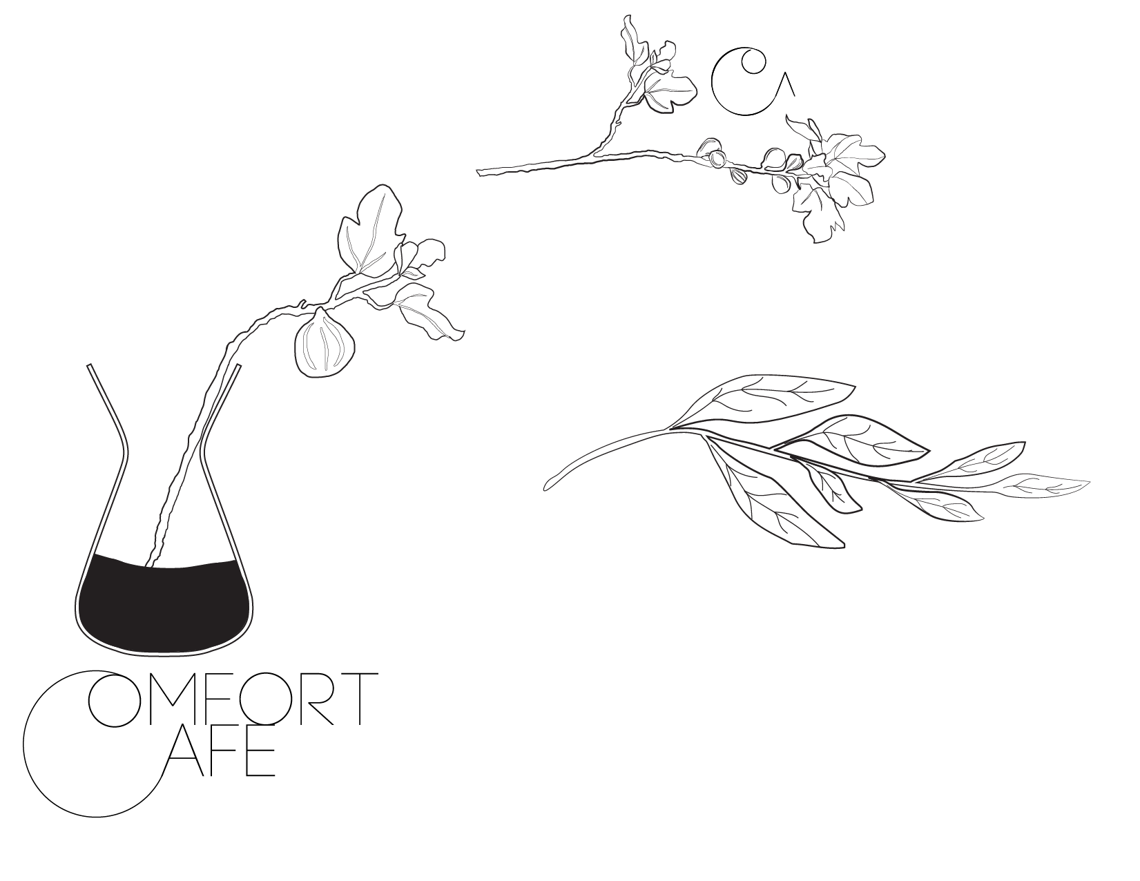
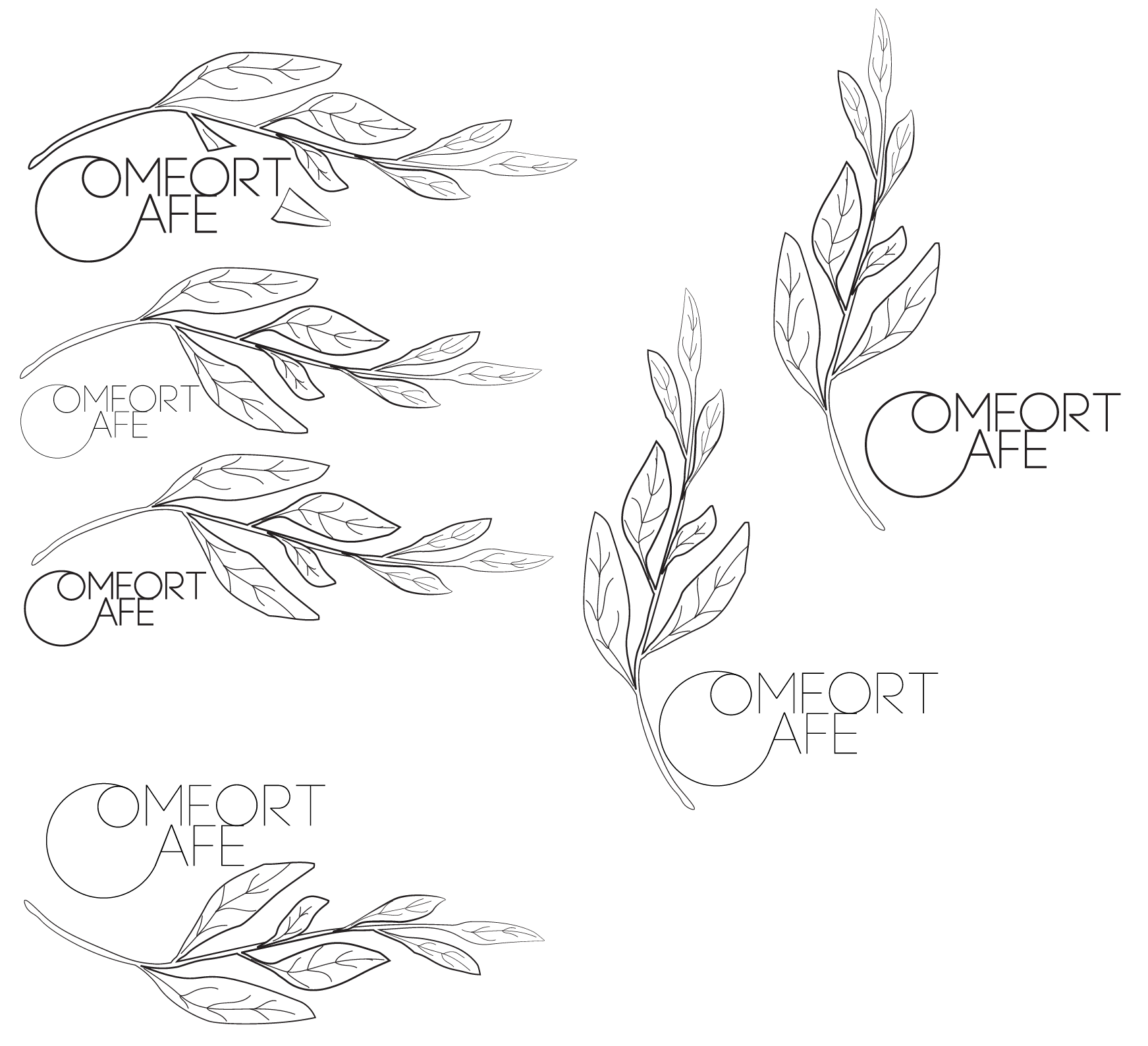
Comfort Café
“Comfort Café” is a concept I had for a business based on an interview with one of my classmates, Caitlyn Yamashita. I learned Caitlyn had an affinity for everything in life that created comfort: crewneck sweaters, plants, coffee, tea and the like. Based on this information, and more personal information about her, I created a product line for this fictional café.


Adobe Illustrator Portrait, Billie Eilish

Adobe Illustrator Portrait, My friend Sam
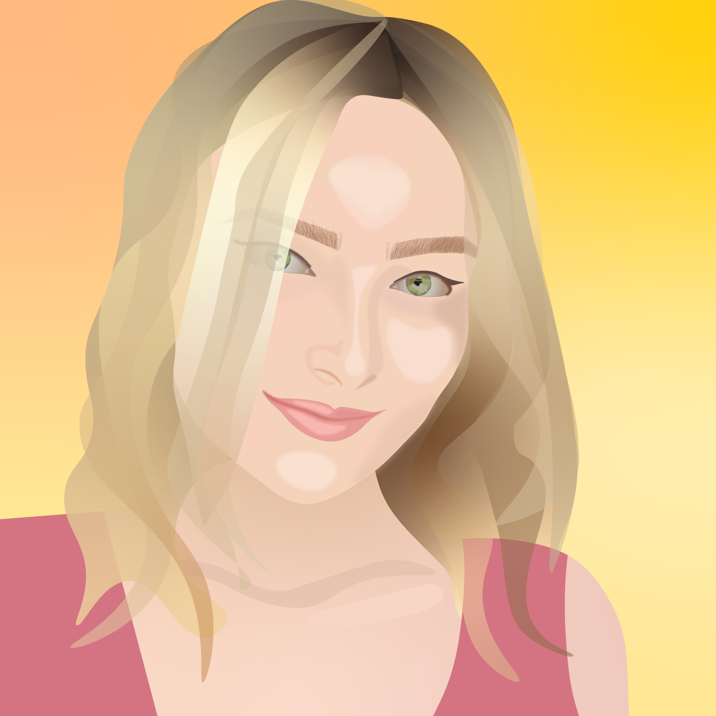
Adobe Illustrator Portrait, My friend Laura
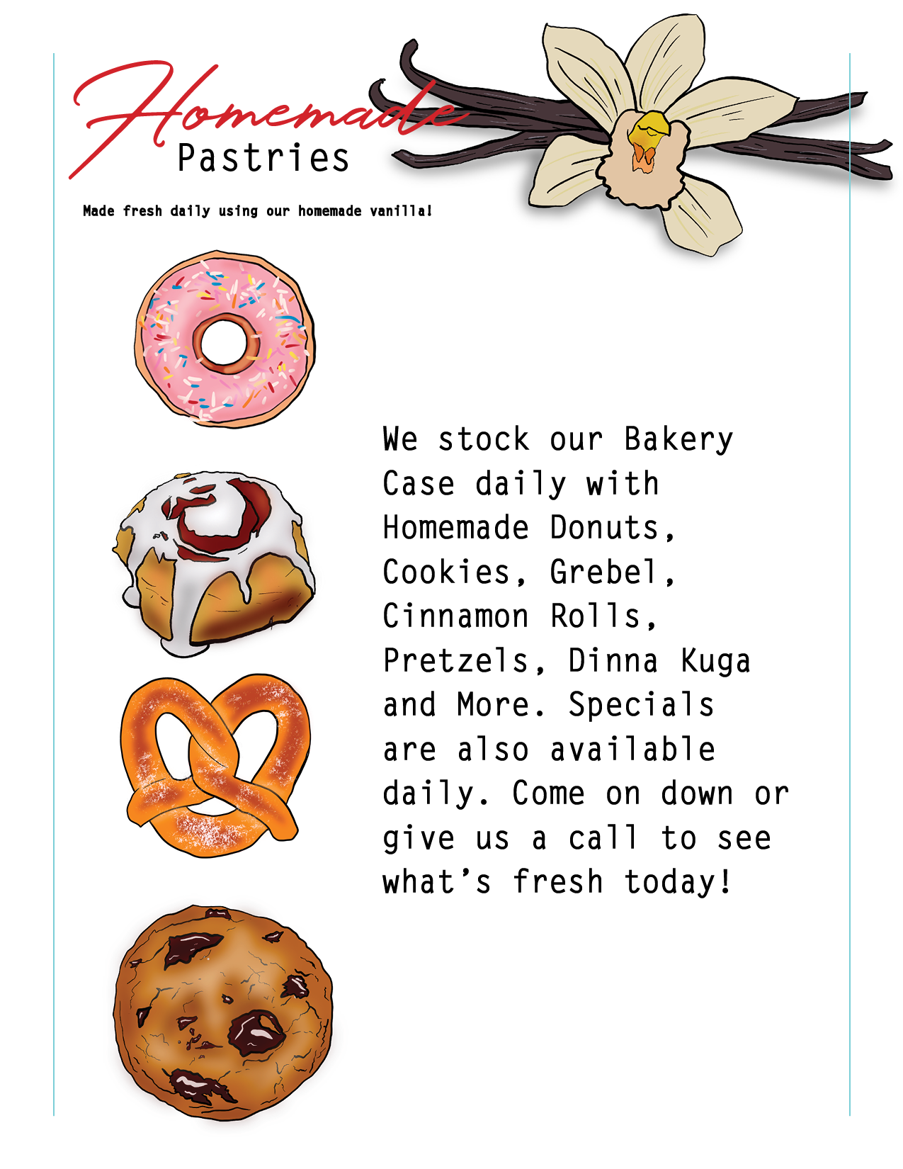
Menu Redesign
2020, Adobe Indesign, Procreate
The purpose of this assignment was to exercise my skills in typography, design hierarchy and page layout. I redesigned a menu from one of my favorite restaurants at home.


“The Back Room”
2019, Adobe Illustrator
The piece below is a conceptual triptych based around the song “The Back Room” by Julian Lamadrid and Rence. The song has three distinct parts to it, evoking the three constituents of the piece. The overarching themes of the song include dissociation, loneliness and love. Give it a listen and see how the song and the lyrics translate to this piece!


